

Redwood Foundation for Education
The Redwood Foundation for Education was founded in 1964 as the Josephine County Educational Fund.
By 2021, after nearly sixty years in operation, the foundation’s leadership had reached a consensus about the need for a new name that more accurately reflected its work.
The foundation needed to create brand awareness within the region, build trust among new and existing stakeholders, and convey their investment in the region at large. And they needed higher caliber print and digital tools to communicate in a consistent, professional manner.
Our Discovery Process
Sheepscot’s team conducted a comprehensive discovery process, which helped us to identify the challenges faced by JCEF, as well as their vision for their new brand. This process included:
a kickoff workshop with organizational leadership
interviews with key stakeholders
ongoing strategy calls with the leadership team
extensive research into related organizations, regionally and within their sector
The New Name and Brand
In developing a new name for JCEF, Sheepscot focused on the foundation’s core character traits as identified by key stakeholders: stability, longevity, trust, and a sense of place rooted in Southern Oregon. Top-of-mind for us throughout this process was the need to avoid any name that would recreate the problem they aimed to overcome; the new name shouldn’t inhibit any potential for future growth.
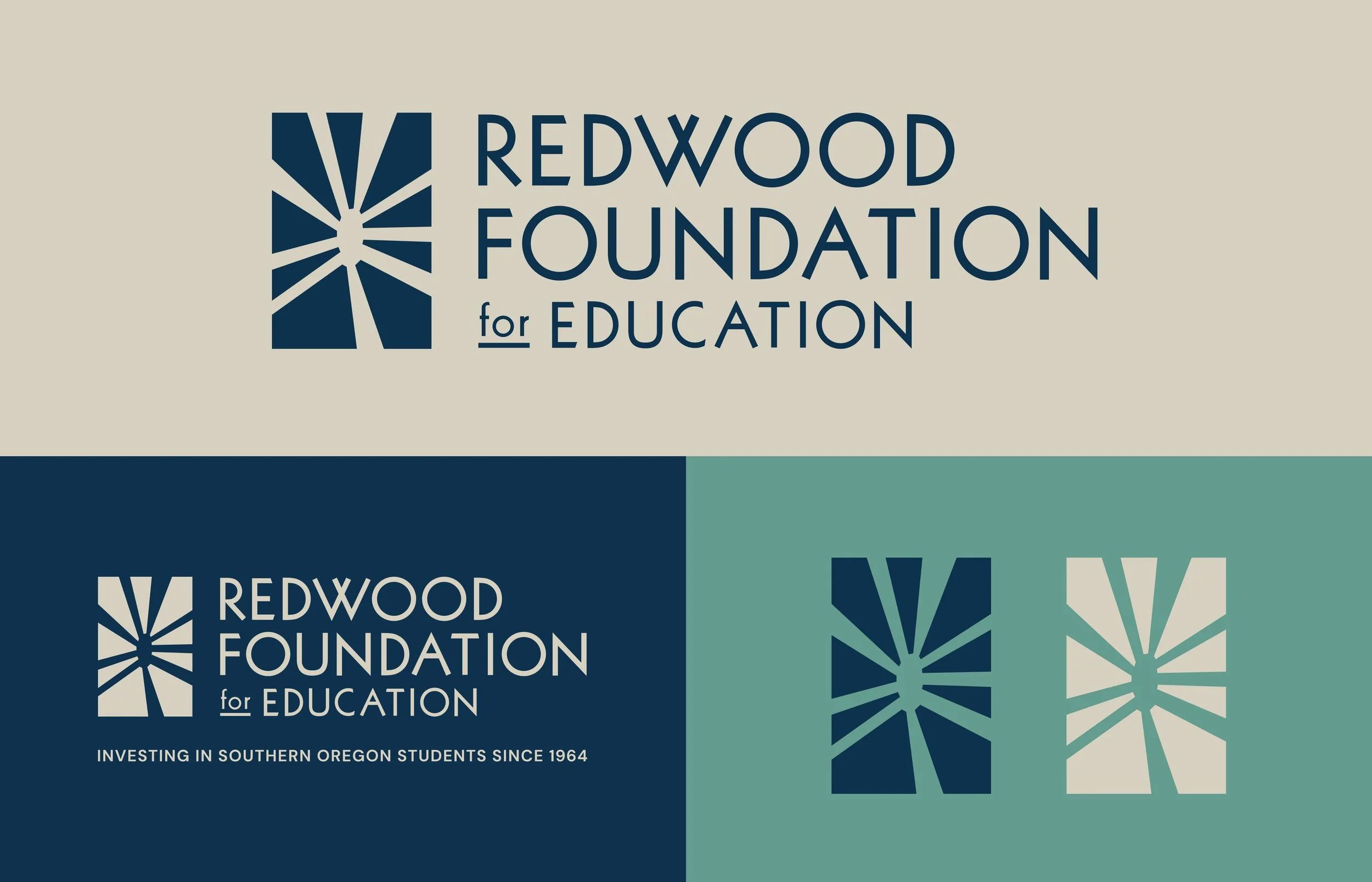
Eventually, we landed on Redwood Foundation for Education. Not only does the Redwood Highway terminate in Grants Pass, Oregon, where the foundation is headquartered, but redwoods truly evoke the sturdy, lasting, authoritative characteristics the foundation strives to embody.
With the name in place, we began developing initial logo designs. We quickly moved away from more traditional depictions of redwood trees or cones—because the foundation’s focus is education, not the environment—and landed upon a “looking up” design, which captured the feeling of staring up into the canopy of a forest. It was unconventional, aspirational and eye-catching.
Once the logo was finalized, we developed a palette of natural, earthy colors to capture the vitality and strength of the new brand.
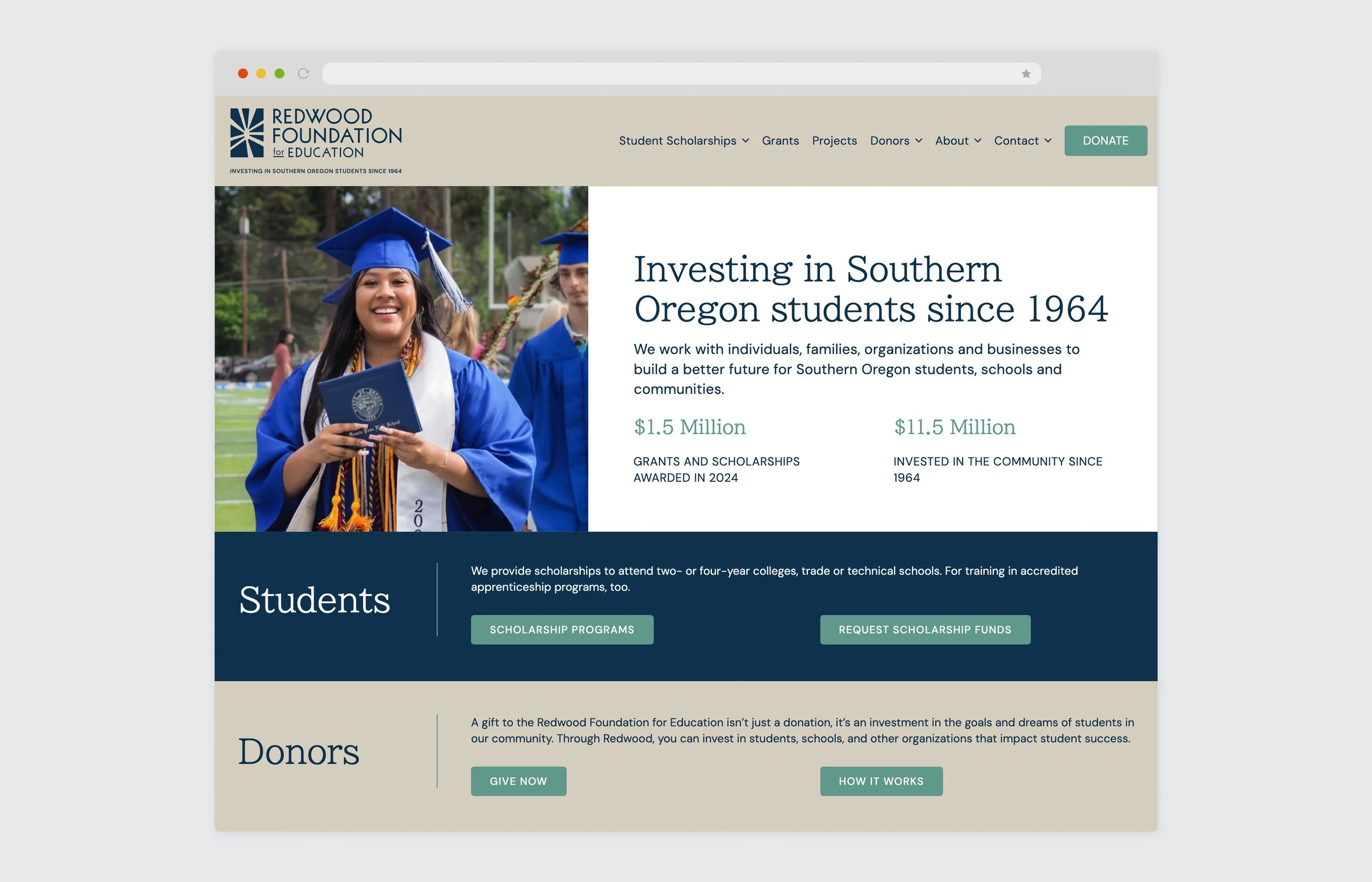
Website and Copywriting
JCEF had updated its website shortly before the rebranding process began. Our task was to seamlessly integrate the new brand into the existing framework of the site. We also refreshed the website copy and navigation, making it easy for donors and students alike to find the resources they need.
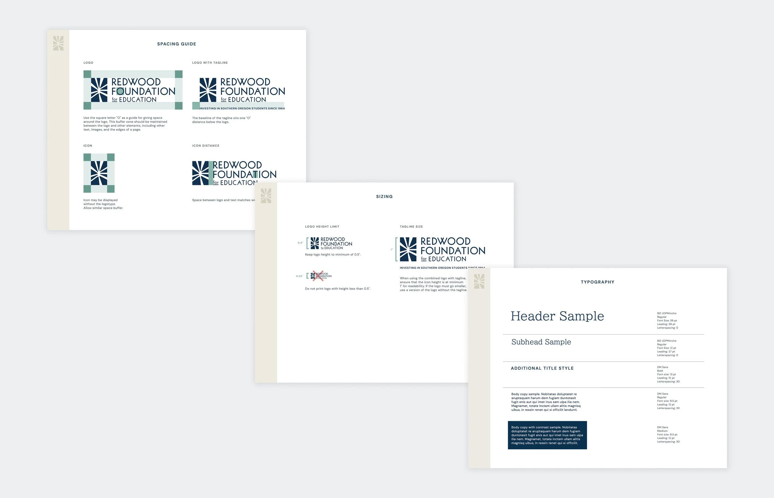
Brand Guide and Print Collateral
A recurring theme from our discovery process was the need for professional print collateral that Redwood’s staff and board could use in their outreach to potential donors and partners. We designed a brand guide and suite of print elements that will allow Redwood’s stakeholders to present the organization to the public in a professional, consistent way.
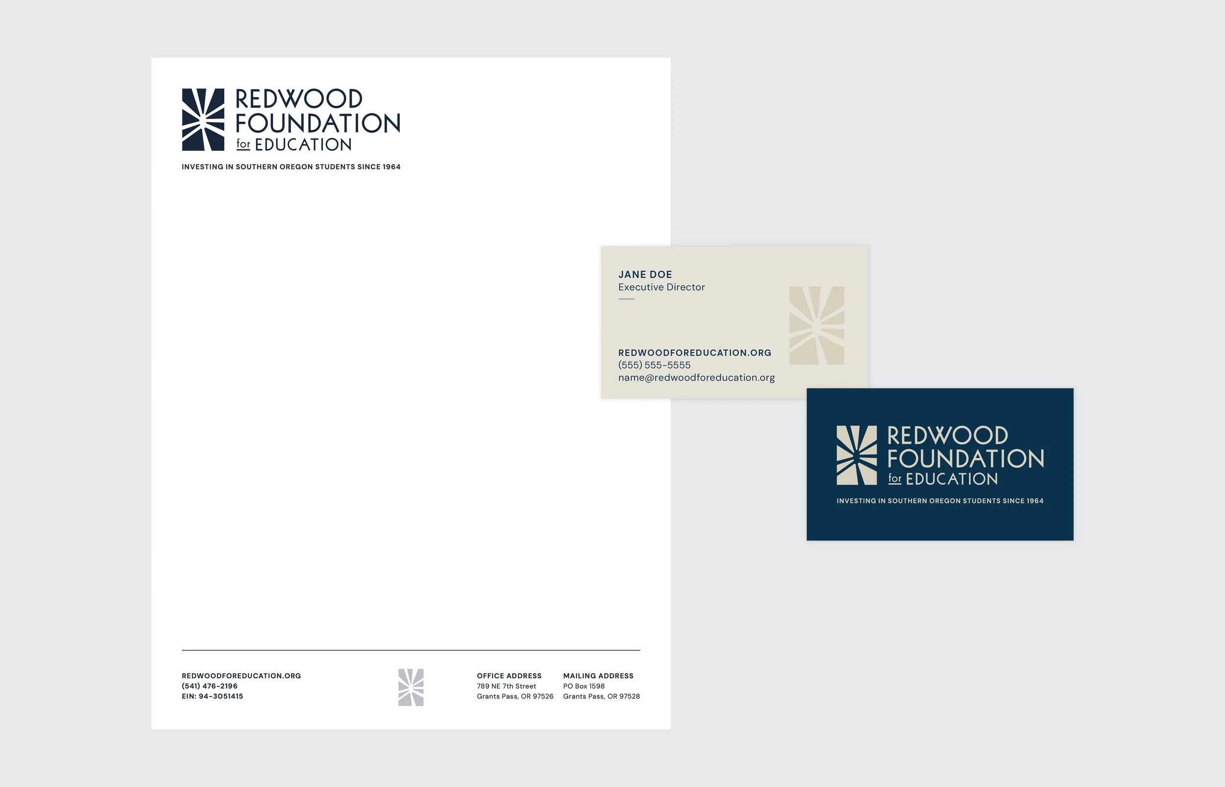
Print collateral included branded letterhead, business cards, envelopes, and note cards.
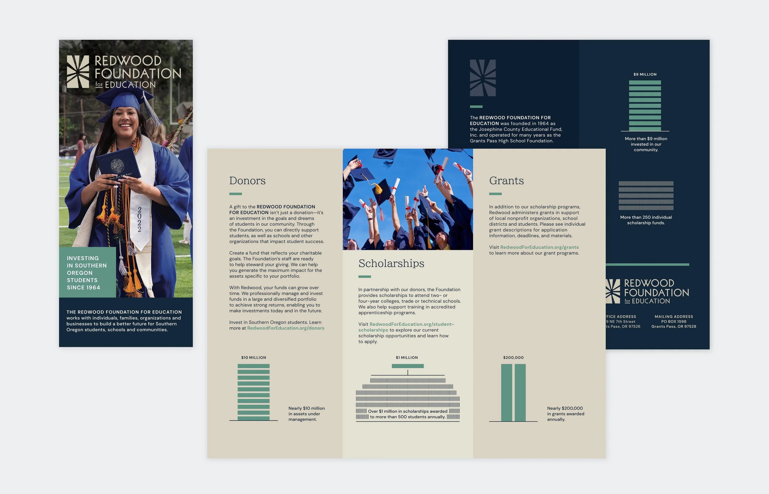
A trifold brochure features infographics illustrating the foundation’s territory and impact.